College not Worth Your Time and Money!
Bad Graph Critique and Improvement blog post
Chart selected:
College not Worth Your Time and Money!
College education just isn't worth the money any more?
Background:
This chart is from an article in Business Insider. Article claims to prove that a college education isn't worty the money anymore. However, the chart is imcomplete and is prone to wrong interpretation.
Chart:
This chart claims that The ROI of education has diminished for all and become negative for many.
Author claims that We have lost the ubiquitous positive financial return on education.
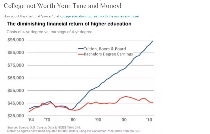
The graph is misleading as it does not take into account following two key points.
- Graph does not show the decrease in earnings potential for a high school graduate in comparison with the college graduate.
- Graph also fails to compare the cummulative life time earnings at various education levels that will truly depict Return on Investment of education.
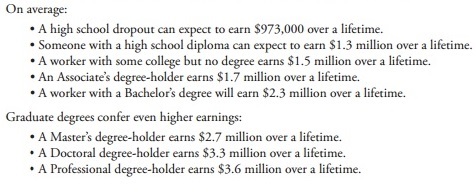
Improvement:
- Earning potentials need to be shown between different education levels.
- Return on Investments needs to take cummulative earnings and future earnings potential.
Following chart (Source: The U.S. Department of Education) shows lifetime earnings among different education levels.
Comparing this to the education expense shows that there is a net positive return.
The more the Education the higher the Return.
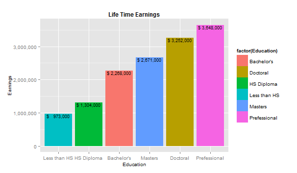
Average lifeime earnings between different education levels.
Unit <- 1000

#Get DAta File from the source directory
LifeTimeEarningsData <-read.csv("LifeTimeEarnings2.csv",header=T,sep=",")

require("ggplot2")
library(MASS)
library(plyr)
require(scales)

(bp1 <- ggplot(data=LifeTimeEarningsData,
               aes(x=Education,y=Earnings,fill=factor(Education))) +
   geom_bar(stat="identity", position=position_dodge())
   + scale_x_discrete(limits=c("Less than HS" ,"HS Diploma", "Bachelor's",
                                "Masters", "Doctoral", "Prefessional"))
   + scale_y_continuous(labels=comma)
   + ggtitle("Life Time Earnings")
   + geom_text(aes(label=paste("$", format(Earnings, big.mark=",", scientific=FALSE) )), vjust=1, size=3)
   + theme(plot.title=element_text(size=rel(1), face="bold"))
   + theme(axis.title=element_text(size=10)))
Resources:
Search result on the misleading graphs:
A History Of Dishonest Fox Charts - Media Matters